If my last 12 months have proven me anything, it is that being brave and working hard on your passions is the only way to be happy. Good things come to those who are proactive and willing to make it happen.
About a year ago, I decided to do something a little odd. I decided to take 20% pay cut from my already average graduate pay and spend 2 days a week working on my passions. Don't get me wrong, I'm already in the field I love and feel that I have most to contribute to. It's just that, I felt the calling -- the calling to give life to my own ideas that I am always telling people about! I really had the urge to learn more about running a business and being an entrepreneur.
So, I took Friday off and became a permanent part-timer at my day job, Vigil Systems.
It was odd at first. I felt like I was just giving money away. My friends were getting pay rises while my professional career seemingly stood still. To keep myself from feeling this way, I decided that my financials cannot suffer despite the dip in my pay. I used to save a large chunk of money from my pay. Now, I save the exact same amount as before. I've exchanged more savings with a downgrade in my lifestyle. I eat out less, plan more for things I have to spend.
Next I had a huge sense of urgency. I wanted to succeed right away! I often got into disagreements with Suneth on the direction we were taking. I was that over committed girlfriend who wanted to go where this was heading on day one. Oh dear.
We built 3 things in the past few months.
First was a music app that never saw light of day. I swear it was such a cool app that we couldn't figure out what to do with it. Shame shame shame. But I learned a significant amount about doing drawRect: operations in iOS UIViews. How to animate, do KVO and use layers to animate parts of a view. Lots of fun!
Next was Momento Jar. It is somewhat a failed product. What I learned out of it cannot even be summarised in this post. I managed to pick up an entire platform (Ruby on Rails), made huge leaps in app design work, learned to engineer bigger apps, learned more things about running a business than ever before! And best of all, Suneth and I made M2D2 Pty Ltd official!!
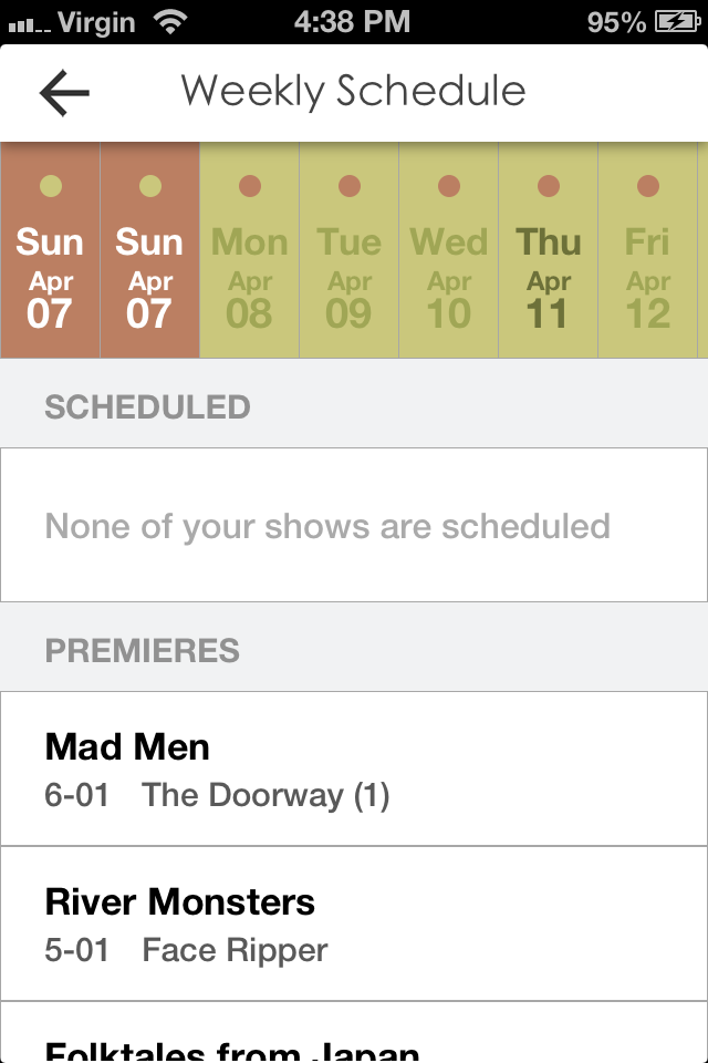
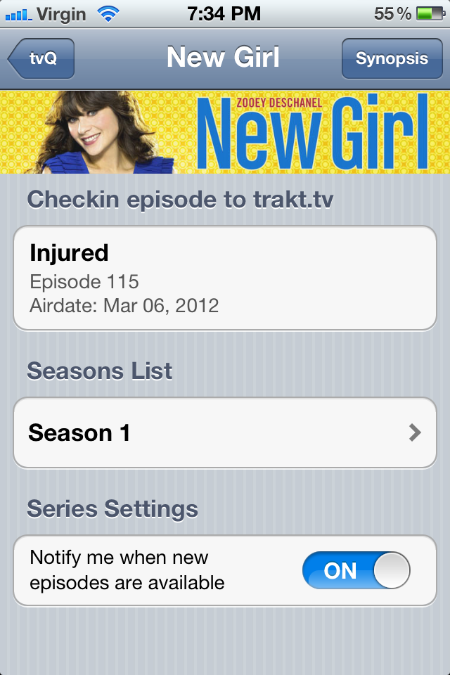
Next, tvQ 2. Sexiest app we ever made I reckon. It is very polished. I just started making a product video for it! iMovie... here I come!! tvQ 2.0 is still a work in progress.
It's difficult to go through everything learned over the year but what I walked away from all of this is a huge sense of accomplishment, despite not having much success financially. I have never learned so much in a course of 12 months! My ideas are more creative and most importantly, much more workable. After the initial change, Friday has been the day I look forward to the most. I have a huge sense of purpose every time I tackle my own ideas.
What's more interesting is that I feel happier than ever before! I feel like my decision to spend more time doing things I love has earned me more happiness credits! It has event brought me around to start taking care of my own health. I've started running again. Overall, life's taken on a better path.
I hope I have success sometime down the line.
Special mention to Vigil, which was very understanding when I decided to take a day off from an already a tiny technical team (4 people!). In hindsight, I think they managed to exchange old me to a happier, more driven and a far more technically competent employee!
When the right time comes, I hope you'll decide to take on all kinds of adventures in your life too. Not just your professional life but your personal life as well. Don't feel bound by what you have now. Exchange them to a greater future and write a new chapter in your story. You'll be better for it -- you would have earned your happiness.
(Image Credit: http://www.wired.co.uk/magazine/archive/2010/04/features/work-smarter-happy)