We’ve been working hard to get tvQ 2.0 out on the App Store (currently doing some beta testing). We really needed a new icon that captured the essence of our new UI and still kept a somewhat familiar vibe. Needed it to be cleaner, more modern and still very much recognisable on the iPhone dashboard.
Here’s the old design and icon:
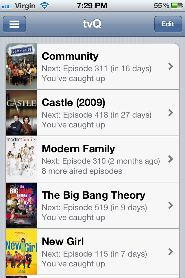

So we began by looking some existing icons that reflected somewhat of the vibe that we needed our icon to give out to the users. Here are some icon designs that really inspired us…
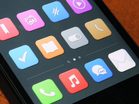
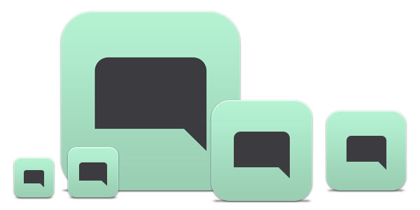
Of course, there was some dribbble.com surfing as usual and Suneth found this fantastic pinterest collection: http://pinterest.com/johnsonyung/app-icon/.
I think it is important to look at what else is out there. Creativity is really a fusion of a collection of ideas put together in a very personal way. And all these ideas don’t have to be original. As a part time designer, it isn’t so easy to come up with a completely original design either.
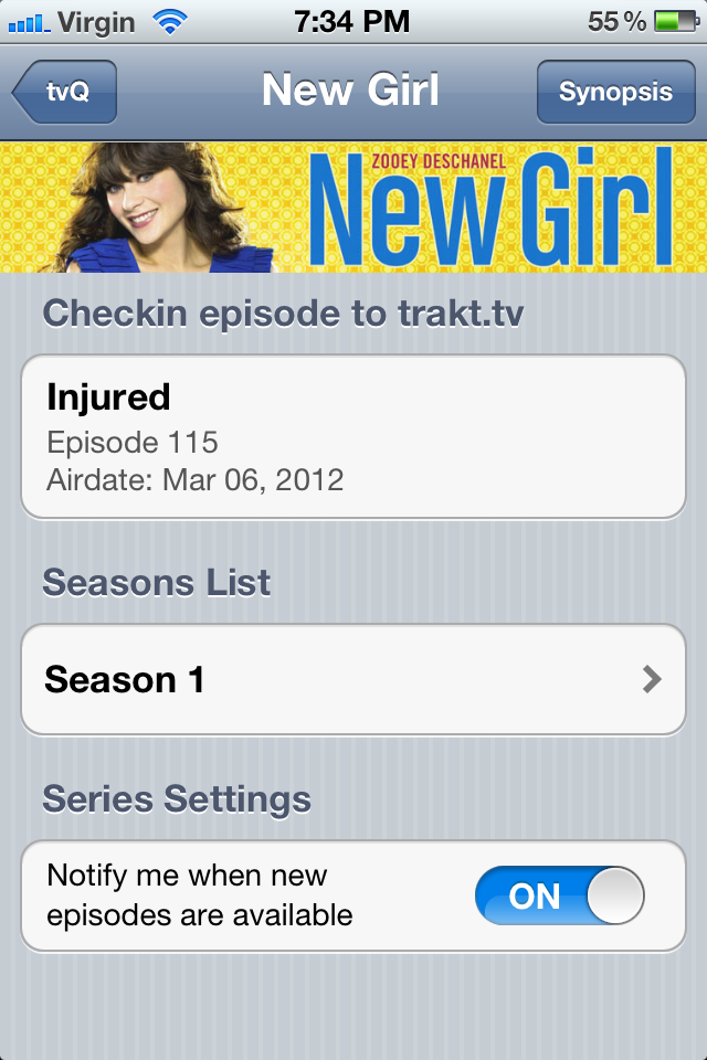
So here’s the look and feel of our rewritten tvQ app:
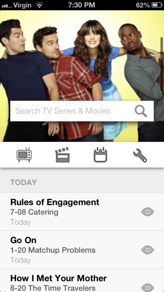
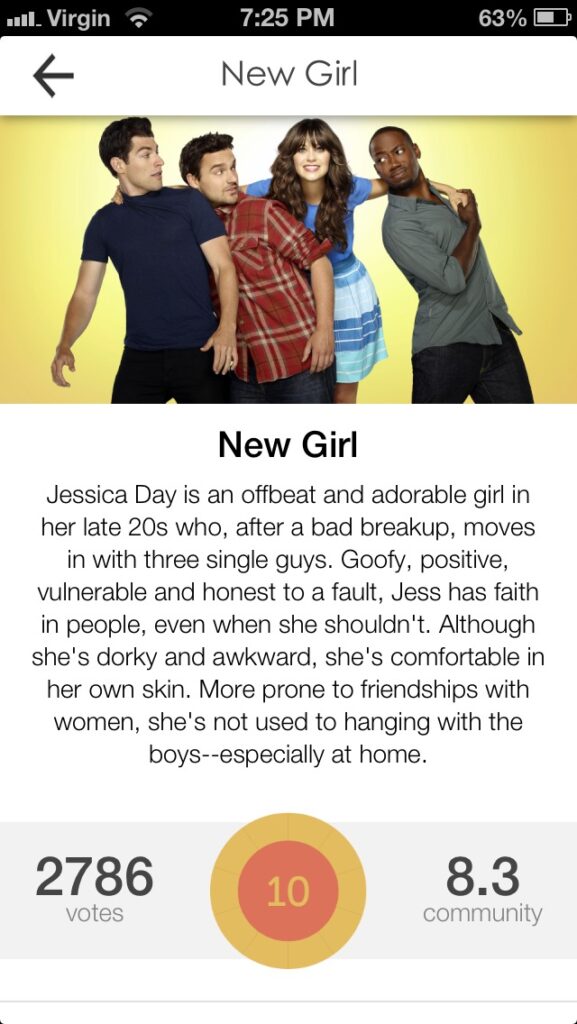
And here’s the new icon… I think we’ve managed to do an icon that reflected the new design but kept a little bit of the old feel. Love it!


Leave a Reply