
I love watching TV shows. I spend about an hour a day on it at least. It’s not just TV, I love movies too. I love the stories in them. It is another world of imagination where there are no limits. I gravitate towards shows which have a long running story, like Game of Thrones. I appreciate the sense of continuity they have. These shows offer a way for me to escape my busy work day when I get home.
In the December break of 2011, Suneth and I were geeking it out trying to solve a very small problem we had with TV: I find it hard to keep up with the story. Often, the episodes aren’t in order. Even if they are, you tend to forget it a little here and there. Busy life gets in the way of tracking these things. So we decided to make a little iPhone app, called tvQ, to keep track of where you’ve watched something to.
So tvQ 1.0 came out. We drew inspiration from apps like Series Guide for Android, which I had been using on my Nexus One. We got some traction after Justin from Trakt.TV approached us for an integration. 50% of our users are from trakt, the last time we estimated the numbers, which is a huge deal.
tvQ v1 is slow. It suffers from slowness brought on by Core Data Framework. We probably didn’t know the right way to go about it, to be honest. It is designed with stock standard iOS controls, which look dated now. We wanted to give it some love and write it in the architecture some of the bigger enterprise grade apps are written in. We wanted it to be fast and focus on the user experience a lot more this time. Other apps for trakt were copying our front page so we thought… let’s make something better! (Haha)
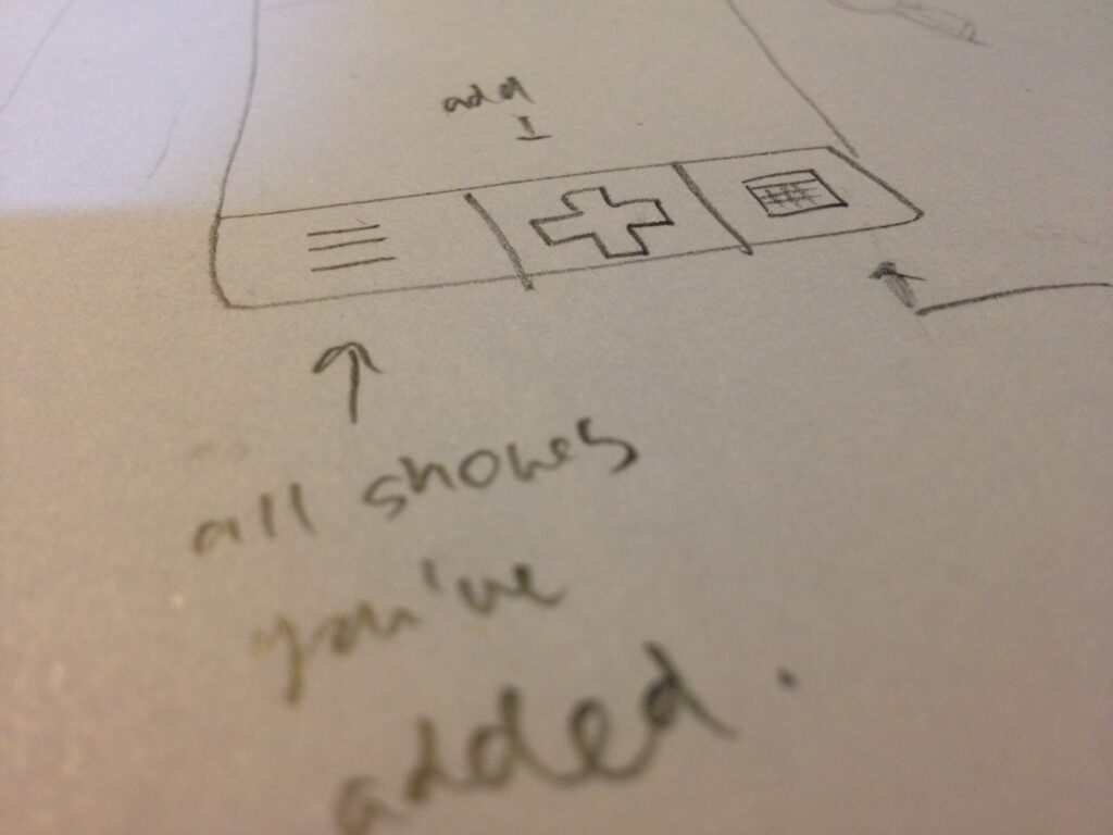
Coming from Momento Jar app, we had sharpened our iOS + Design skills. We started sketching out some of the early designs as you can see here (and some early photoshop mocks):

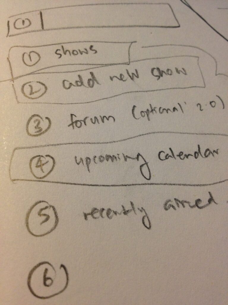
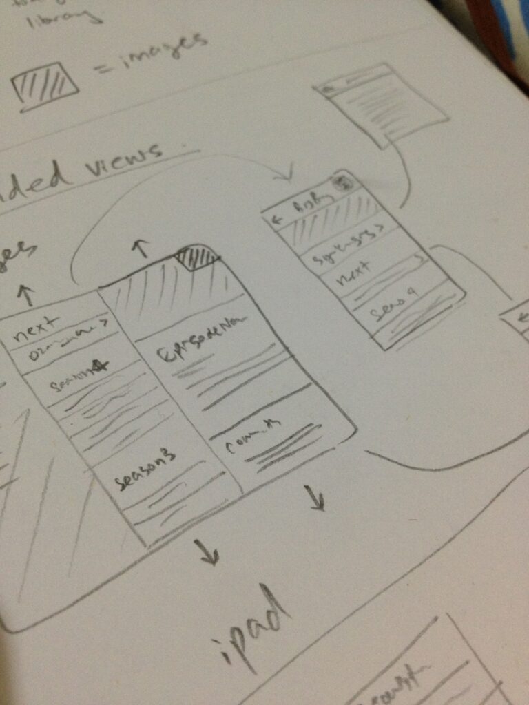
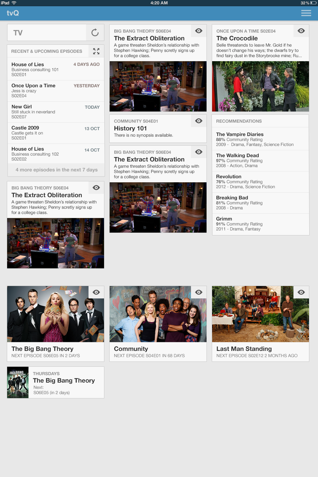

These screens represent some of the thinking gone behind the new design. Initially we wanted to take the 1.0 experience across where we focused heavily on just a single list of shows with their next episode. A lot of the times, this design didn’t always perform well. We realised the main page was more about episodes and less about each series. So we spent time crafting the front page to be episode centric.
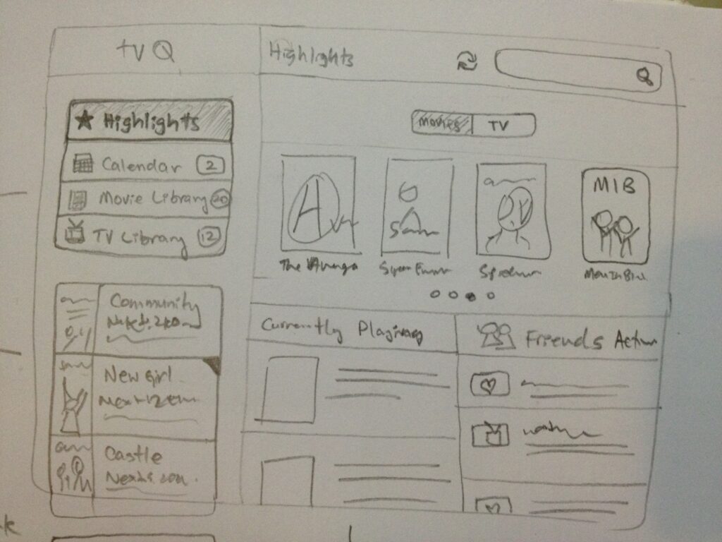
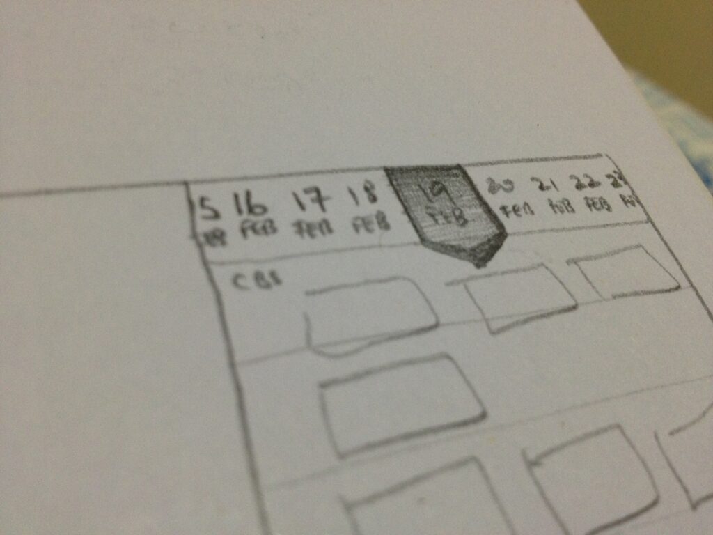
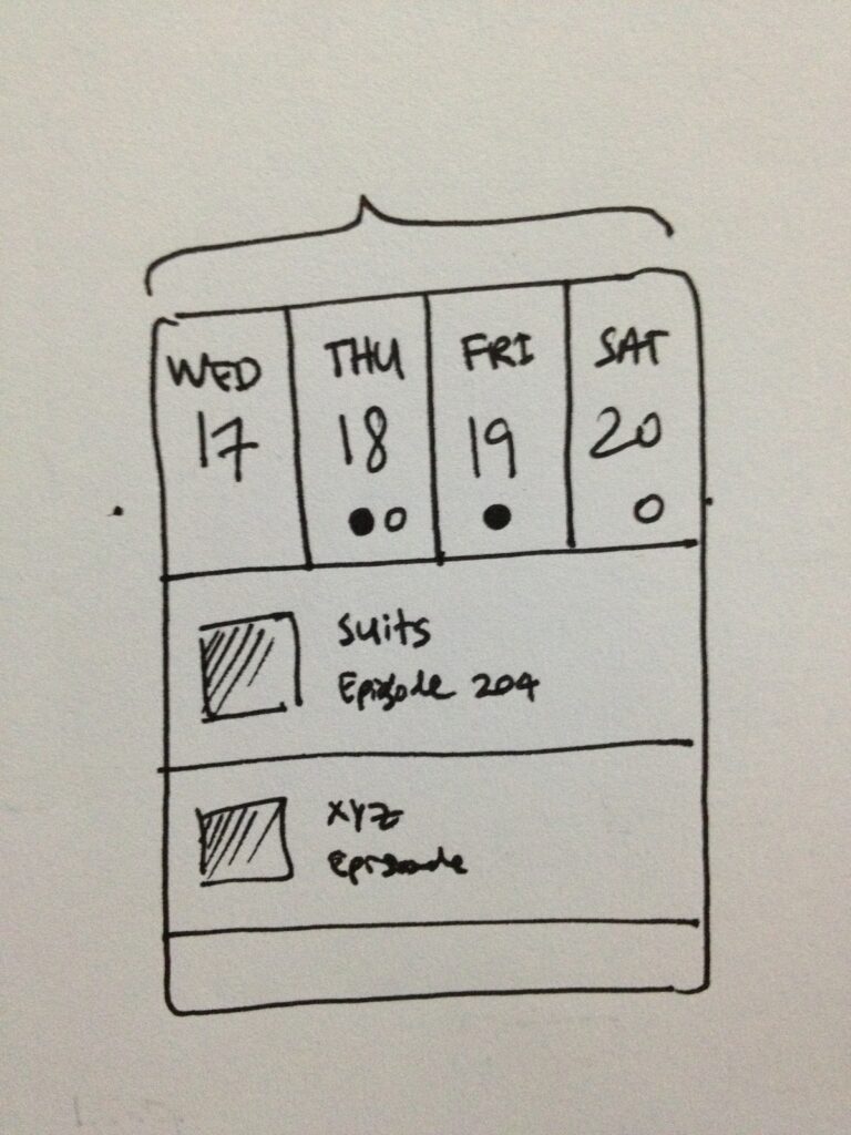
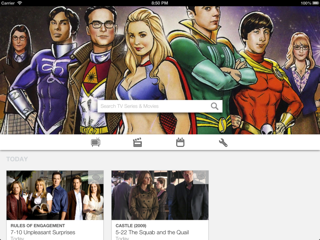
Now, episodes from each show are put into 3 buckets.
We always show you what’s on today. They don’t have to be next in line. It is to say… hey these shows are on today, which might spark your interest to catch up or just see where it’s at now.
Next is upcoming, which is what I look forward to in the coming week. I get some of these stuff online so I keep an eye on these. Sometimes I like to read in advance and see what’s in store for the following week (I skip ads on TV so I don’t see the previews). I can limit this section by saying don’t show me if the next episode is 6 weeks away or more. When Suits is returning in a few weeks time, it will start appearing on the list again… which is exciting!
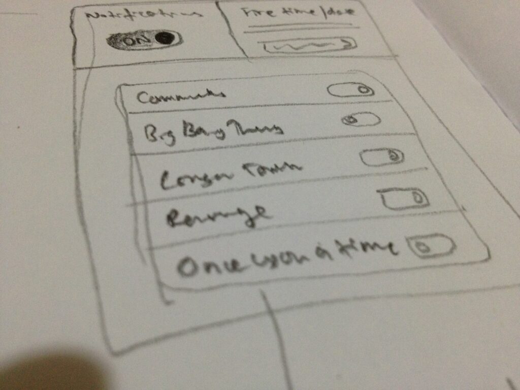
Same goes to past episodes. The thresholds you set for yourself allows shows you neglect to fall off the ledge and stay out of your way. Make sure to set these up in your settings when you get the app.
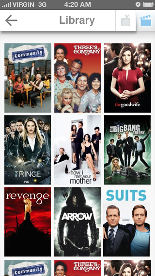
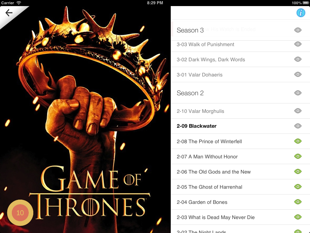
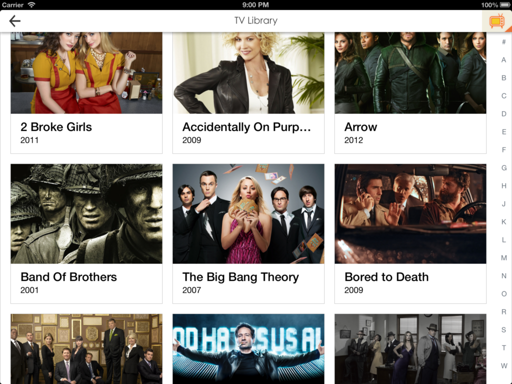
We added a proper library for you to collect shows. Made it so that you can ignore missed episodes for shows like CSI where you don’t care about watching every single episode. We made comments part of the synopsis page to see immediate reactions from other community users (trakt only).
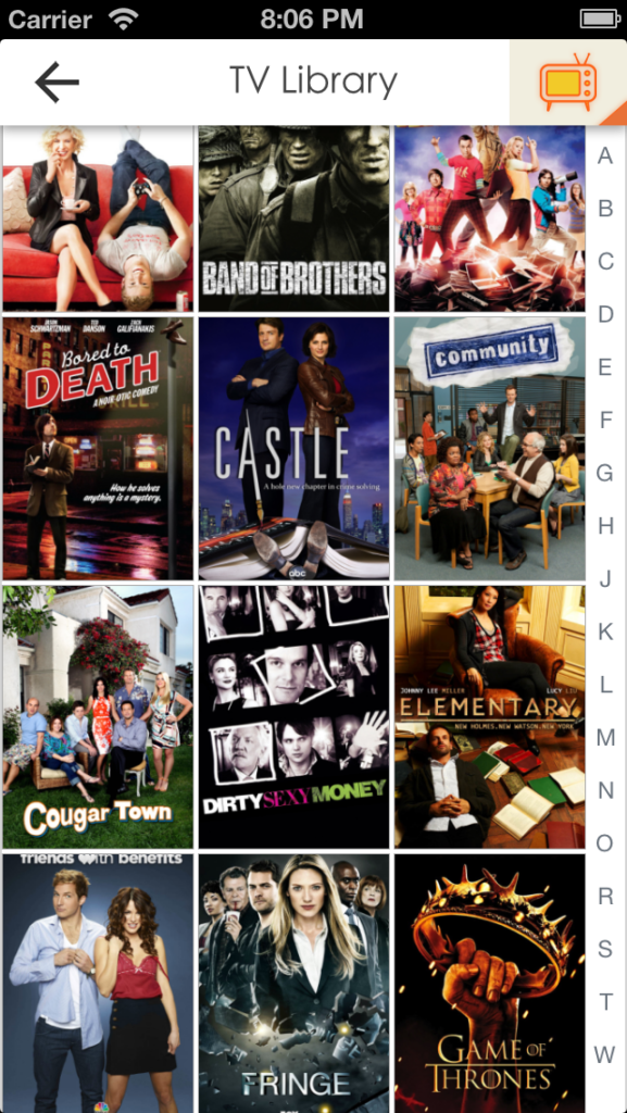
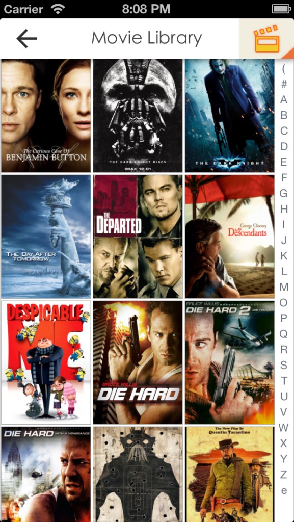
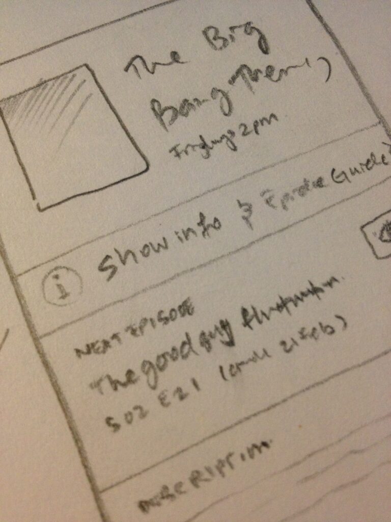
One big change this time around is artwork. We put fanart and posters in the center of everything. This doesn’t mean we compromised on design at all. They elegantly fit in and add color to our app. You will realise the app is white for most part, with neon styled icons. The rest of the colors are really added in by the great artwork, giving color to every page. Our experience with Momento Jar really helped out here. There’s a bit more technical knowledge involved in caching, cropping and animating images to get the most out of them. If you get the iPad version, you will see that the obsession with great artwork continues. We hope you love it!
We did a lot of work in the backend too. It is a brand new codebase. We threw out everything we had before and made everything super fast. We used the Command & Engines architecture (future blogpost…?) to organize everything properly.
In the end, we’re very pleased with the result. I think this is a world class app, for both iPhone and iPad. It is made with love by Suneth and I, who uses the app on a daily basis. We hope our effort will convert to a large number of downloads. Tell everyone about it! It’s available 10th of May. Our app experience puts us firmly in front of the TV tracking apps out there. We intend to be creative with our features in the future releases. If you have awesome ideas of your own, head on down to our 60Hz page and start a discussion about it. We love hearing everyone’s take on the app and the community support.
Thank you for reading. Here’s the end result (we felt serious about the app that we made a video about it!!!). Tell your friends… iPhone app is FREE on the 10th!!! 🙂
Leave a Reply