mobile

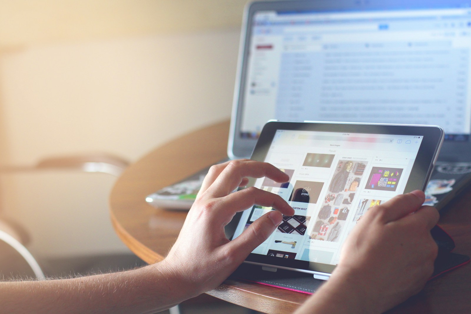
This year, everything should go “Touch-first”

Happy 2017!

I’ve been considering buying an iPad Pro. I’ve always felt that the iPad is an "in-between" device that can’t fit my life well. But there is proof that the desktop is getting... deprecated. Here’s a good article from The Verge that talks about it.

Is it time to transition over?

By the end of 2016, many major websites saw traffic shift from desktop to mobile. Mobile has become the dominant form of computing for the every day consumer.

From a platform perspective, native apps started to transition over to web experiences. Hopefully, "Progressive Web Apps" will replace the generation of native content apps we have today.

What we didn’t seem to have gotten around in 2016 was to really question our approach to mobile and touch. Our approach remains primitive. We pick up interactions like "text editing" and try to retrofit mobile into it. We don't question the fundamentals to ensure the new experience fits well. I can’t help but feel that “keyboard covers” are a grave mistake.

Consider how someone uses a mobile device. He/she would be leaning back on a comfy couch, holding on to a tablet with both hands. Or, they may be standing in a crowded train, arm wrapped around a pole, trying their best to type with the two thumbs. The users' posture and environments above doesn't allow for a traditional editing experience.

We have to be more creative with the solutions we engineer. If we do transition well, these touch-first solutions should make us more efficient!

Also consider the change from a mouse to multi-touch. Direct manipulation of objects could be amazing. We see some of these interactions when we use apps for drawing, photo editing or maps. But more mundane tasks, like text editing, never seem to get much of a boost from touch. We seem to staying on safe ground with rows of buttons to carry out functions. We spend significant time manipulating and navigating between elements. Yet, these tasks tend to be not touch friendly; at least not enough to be more efficient.

It feels like we transferred the interaction to mobile, instead of converting the intent. We should be evaluating the purpose of every task and attempting to accomplish that in a "touch-first" way.

It seems that we have some ways to go before we get really good at mobile and touch. I’m hoping for a 2017 filled with ideas and techniques that shifts our thinking. I’m hoping we build products that are thought from a touch-first (or even touch-only) perspective.

Mobile First Design

If you are designing for many screen sizes, where should you begin?

Traditionally, most designers will start the design process at desktop size. This is where most content is going to fit in well. Then you figure out how to squeeze it down to a tablet, then a phone.

I believe this is the wrong path to take, when designing a mobile responsive page (or any website for that matter). Just because a desktop page can flow responsively on a small-width screen, it doesn’t make it suitable for mobile.

The best thing you can do is to start with a mobile design. Straight away, you are met with a conundrum: how do I fit all this content into the tiny screen? You can no longer just drop a matrix or a data table on to the screen — there really isn’t enough space.

You are forced to think about questions like:

  • what you are trying to do?
  • what are the most important elements a user needs to interact with?
  • what is the most important action that needs to be taken after viewing the content?
  • can the content/data be summarised and simplified?
  • can you offer a better way to drill down to your content?
  • can my data fit into an existing metaphor (like a map or a calendar)?

Once you are done with the design process, you might have a crazy realisation: all the questions you asked yourself, and the resulting design decisions you made — they apply on desktop too.

That’s right. A good design is already responsive.

Now, desktop design becomes more about enhancement over a lazy content dump. You’ve already made the decision up front on what is important and what is not. You no longer feel dirty, having to add ‘small-hidden’ css classes everywhere.

Start with a mobile design on your next project. Your design will be better for it. When you pick tools like the responsive grid, pick one that starts with mobile too. Bootstrap 3, for example, switched gears to do exactly this.

Responsive is hard. Mobile is hard. But the thoughtfulness and effort we put into what we build will delight our customers. And our customers are the reason we exist.