...and there are physical buttons! Tesla's dashboard definitely looks dated next to this.
Love the new Mini's digital dashboard
in LinkOffs
UI
...and there are physical buttons! Tesla's dashboard definitely looks dated next to this.
A lot of the time, design is a step that is left up to the developer working on a feature. He/she is given full liberty to make a decision on the user interface. Often, there is not enough to make an informed decision on the UI, even though he may be capable of coming up with something aesthetically pleasing. Spending time on design can feel like a waste of time, effort and ultimately, money. This is, of course, not true.
Design is where marketing, sales and brand meet the product and its platform. It is the round table where all departments can sit down to have an equal say on how a product’s development effort can be be part of the bigger story.
A designer can interpret some of the abstract thinking behind features to produce a consistent design, which in turn can be interpreted by the technical team. A designer’s job is a lot more complex the just coming up with a fancy UI. He has to worry about the narrative, and ensure that the UI reflects on the spirit of the product.
Event a tiny feature like a word count in your word processor product can be a complex decision. You could
The right decision can depend on a number of factors like user stories, target audience, client requests, estimated frequency of usage, new target markets etc. If you look closely, Google Docs chooses to hide it in a menu while Word has it in the status. Reflects well on what each product tries to achieve.
At the end of the day, UI is how your user forms a long term relationship with your product. The message you carry is important for this relationship to grow. A solid design process can go a long way.
I think Windows 8 is great. It is fast, the UI is simplified and it is a much needed reset for the Windows ecosystem.
The problem is, however, the way Microsoft’s latest desktop offering ignores the desktop users altogether. Windows, as its name states, has always been about desktop + windows. This is a metaphor that has worked for as long as I’ve been using computers! It’s been tweaked a whole bunch, but at a basic level, the idea totally works! Windows 8 is really a touch first OS now. It is awkward to use mouse with it.
So here’s Microsoft’s “vision” for the future:
A future where people do one thing at a time (and everything’s a giant screen :S)...? Well, actually, there’s more to that vision. There’s a very powerful theme running all over this video that many people don’t pick up on, and that is, context.
Context is everything. With a world that is constantly changing and moving, it has becomes so much more important. Problem is, computers haven’t been great at this. Humans are a funny bunch and computers have a hard time predicting anything with enough confidence to enable a fluid software experience that changes with context.
This is why Google Now! really excites me. It is Google’s stab at a move in the right direction. It is automatic and it tries to be a little bit smart for you -- in the background.
I digress.
If we combine the lack of context with the single task focus on Windows 8, it is not a good cup of tea for most desktop users. Microsoft thinks people would just work on a presentation or queue music or surf the web (or 2 at a time). But this is how my desktop looks like:

Yep - It’s a mess. And people are generally messy. So here’s my pitch to Microsoft:
Stay true to the namesake. Let Metro apps work in a Window mode! Here’s a sample metro app (Outlook):
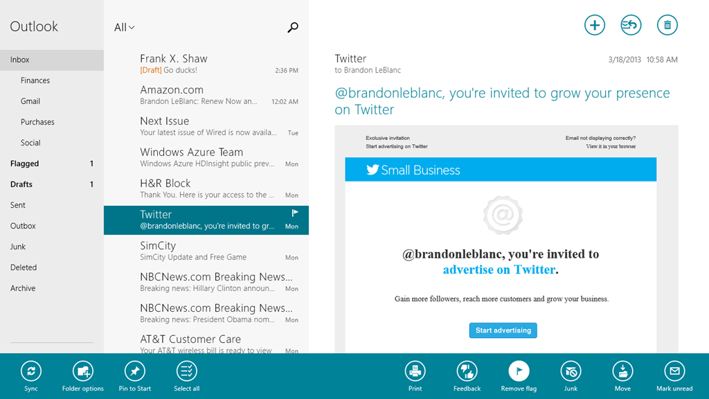
Let it window down to this:

The toolbars will form the application’s ribbon. The top menus like tabs in IE will also become tabs up top. Being on the desktop mode, developers can allow for more complex options in the ribbon too. Like Android where menu button and ActionBar overflow works interchangeably, so will the ribbon and full screen toolbars. There's a lot of missing features here, but you get the idea.
If the user is detected to be in the desktop, the app should start windowed like above. If they maximize or start the app on a tablet, it should automatically go into the tablet mode layout. Given the power of XAML and it’s great great layout system, I don’t think this is impossible.
This would have taken us to a new UI design language without completely alienating all Windows Desktop users.
Let people work in the desktop. It works best for multitasking. Keep the new start menu, but add more daring context awareness. Then we’ll have a wonderful OS with a more coherent experience.
